4 Reasons Why Your Website Doesn't Convert
5 mins read
The internet is full of tips on how to increase website traffic, but attracting users to your website is only the first step to successful sales.
Even though people spend online up to several hours a day, you only have a few seconds to convince them to purchase from you.
In this article, we discuss the most common reasons why websites fail to convert and how to avoid them.
1
75 % of users judge a company's credibility based on their website
Online users are suspicious, especially when they find your website organically without any referrals or recommendations. Is your web legitimate or a scam? Up to 75% of users judge your entire business based on the design of your web.
Pages full of ads, colorful and illegible fonts look untrustworthy, and users tend to leave them very quickly.
See for yourself how powerful the design is. So, which company would you rather buy from?
Source: SWEOR
Action Steps:
Look at your website from the user's perspective.
- Is your contact information together with terms and conditions displayed in a visible place so that users can find them in a few clicks?
- Is your website secure?
- How many ads and pop-ups do you use?
- How quickly can a user navigate on your website? Is a menu or breadcrumb navigation visible on all pages?
Then, get feedback from an unbiased person.
If you decide on DIY web testing, this will for sure reveal some critical issues on your web. NNgroup states that with the help of 5 users, you can detect up to 85% of errors on your website.
Importantly, these 5 people must belong to your target audience. Show them your website and then ask them for their opinion. Write down all the information, it's your goldmine that will boost the performance of your web.
And for the remaining 15%? Book a website audit from a renowned UX professional.
2.
88 % of users won't return to the web after a bad experience
Having a beautiful design of your web isn't enough. Sites that provide a bad user experience (UX) are likely to get a high bounce rate, no matter the design.
Impatient users don't have time to search for information that is missing on landing pages or click through the whole web to finally get to the purchase. Up to 88% of users admit that they are less likely to return to the web after a bad user experience.
Let's be practical here. What does a website with a good UX mean?
Every website has a goal, e.g. to sell or increase brand awareness. A user-friendly web navigates users to this goal. All the essential information is displayed visibly, and a user doesn't encounter any issues when logically moving to the goal.
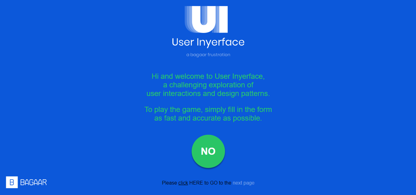
Not sure whether UX and UI can have such an impact on users? Try this small test. How long does it take you to get to the second page? And will you be patient enough to get to the third one? :)
How to improve your website? Read our 5+1 UX Improvements To Boost Conversions of Your Website
3.
89% of users are less likely to return to a web that is loading long
With Google's algorithm update and the implementation of Core Web Vitals, fast-loading websites have become even more critical. Conversely, with a slow website, it's almost impossible to get among the first results in a Google search.
But a slow website doesn't just affect your position in SERP (search engine results page) results. Approximately 83% of users expect a website to load within 3 seconds, and leave if it doesn't. And 89% of overall users won't return to a site that takes a long time to load.
The speed of a website is also directly related to its business results. Globally, it is estimated that annual loss sales due to slow-loading websites reach $2.6 billion.
Users get tired of waiting and leave the white pages quickly. If their behavior was impulsive, they are likely to change their minds about the purchase as well.
Action Steps
Check the loading speed via PageSpeed Insights. On average, every second of loading time increases the bounce rate by 123%. Conversely, speeding up loading by 1 second increases conversions by up to 7%.
Common errors that slow down the web:
- Check the size of images on your web. As a rule of thumb, it shouldn't be in MB. If you find some of them, reduce/lower their quality. A size of around 100 KB will be sufficient in most cases.
- Consider implementing a lazy loading feature. The images will load a bit blurry at first, which will speed up the loading of the whole page.
- If you use WordPress, avoid installing a large number of plugins.
You'll also find a number of tailor recommendations for improving your website after you run the PageSpeed Insights analysis.
4.
Half of online users browse on mobile
The exact number depends on the region you are targeting and the industry you are in. In general, however, half of users prefer to access websites on smartphones and expect a responsive design. 74% of users rather return to a website that is optimized for mobile.
Not having a responsive website has a far greater impact on your business. 57% of users wouldn't recommend a business with a poor mobile design. So in addition to losing potential customers, an unresponsive website can take a toll on the reputation of your entire business.
Traffic from mobile devices has another common feature, especially important for local businesses. Up to 64% of users who visit your site on a mobile phone will call or visit your store in the next 24 hours. A responsive website is therefore not only important for large corporations but also for smaller local businesses.
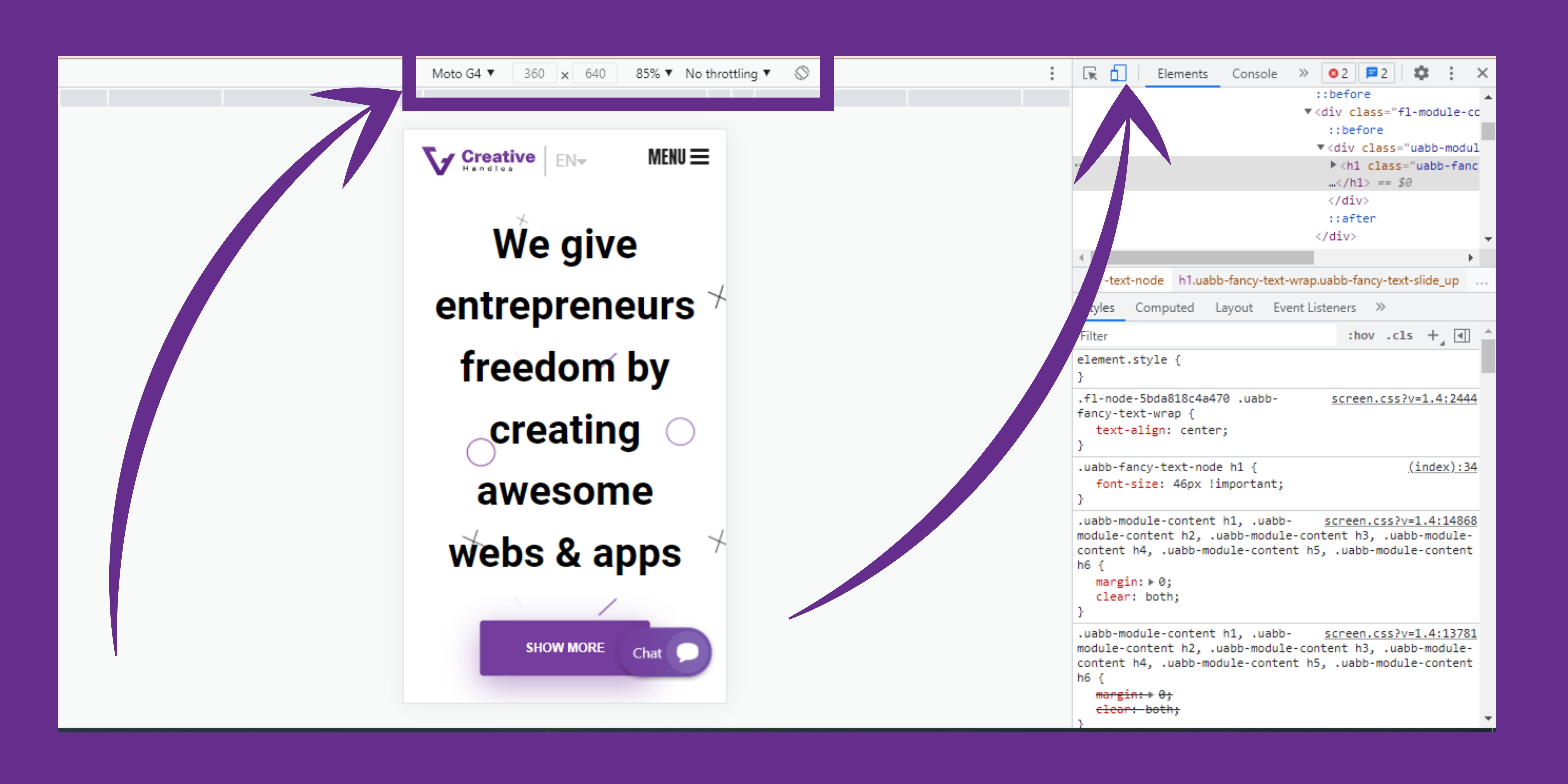
Tip: Find out how your website looks on different mobile devices. Right-click on the page and select "Inspect". Select mobile view, where you can choose from a variety of mobile devices, resolutions, and more.
Bonus Stats and Tips:
- Users make an opinion about your website in less than 1 second.
- Users spend less than 6 seconds scanning written text.
- They spend about the same amount of time looking at the main image.
- Responsive sites that load in less than 2 seconds have 15% higher conversions.
- As of August 2021, there were 1.88 billion registered websites.
Recommended read for increasing your conversions
- Users spend more time on pages that contain videos. 3 Reasons to Add a Video to Your Web
- Focus on sales pages and landing pages for campaigns. Find out how to do this in 10 Tips on How to Build the Best Landing Page
- Learn how to make your texts more attractive 8 Tips How to Make Users Read Your Articles
- Action buttons navigate users and have a significant impact on conversions from your website. Call to Action Buttons - 5 Most Important Tips to Get More Clicks
Final Tip
Do you feel that your company website doesn't work as you expected? A web audit will reveal the reasons and possible improvements. Contact us to get the final report with action steps that will lead to increased orders.
Schedule a free consultation
Pavla Travnickova
Marketing Manager
B2B content marketing specialist. With more than 5 years of experience in European and Asian markets, Pavla provides Creative Handles readers and clients with useful advice and tips on how to improve their website. Wondering how to design a website to communicate what you need? Write to pavla.travnickova@creativehandles.com


