5+1 UX Improvements To Boost Conversions of Your Website
8 mins read
Good UX design works for you and your business results. Users don't get lost when navigating on your web. They head directly to where you want them to go/click, fill in your form, subscribe to your channel, or contact you. They make those actions that convert and bring profit to you.
Creating a user-friendly website doesn't have to be just a matter of in-depth UX testing managed by a UX designer. Of course, these people are professional, and your DIY usability testing will never reach their level, but there are a few UX fixes you can make on your own.
Summarizing the most common UX mistakes business owners make, today, I have prepared 5 + 1 tips on improving the user experience interface of your website, all by yourself.
Don't waste more time and check the proven UX practices to improve your online business results.
1. Page Speed
Make sure that your website loads quickly – in less than 3 seconds.
How do you measure web loading speed when it's affected by many factors, such as computer performance or the quality of your Internet connection? Google has developed a free-to-use tool for this purpose. All it takes is just one click, and PageSpeed Insights will generate your site's load values.
Remember, users are impatient, and any delay in loading the website decreases conversion rates. Based on data from Wallmart and Tagman, the difference in sales between fast and slow loading pages is horrifying.
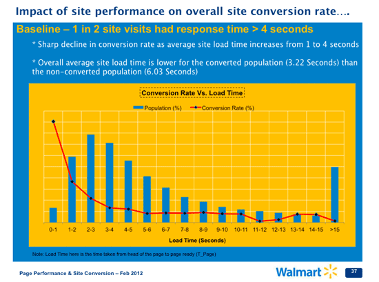
Is the page loading in more than 3 seconds? You're in hell!
In today's impatient times, you lose tens of percent of users.
Make sure the loading time of your first visible screen does not exceed 3 seconds. It is a crucial factor for converting users to clients as any other web improvements will be just a waste of your time. Your users will never get the chance to see them anyway.

Source: truconversion.com
Tip: Check your speed results here
2. Tell Who You Are
Browsing the web is getting faster and faster. Users are not willing to explore your page. Their goal is to get what they need and disappear quickly.
Understand how users read online: 4 Types of Eye Tracking Patterns: How People (Don’t) Read on Web.
Be smart enough to offer them what they want to see in a very short time.
Summarize your unique selling proposition (USP) into a powerful claim and place it above the website fold. This is the only way to ensure that users will immediately understand who you are and why they should be interested in your services or products.

Visitors of your website give you approximately 5 seconds to impress them; no more. If your website is loading for a while (1-2 sec.), then you have just 3 seconds to ensure them that they are in the right place!

Visitors coming from the organic traffic have no idea who you are. If you don’t show them a clear value proposition, they will stay on your website for a maximum of 10 seconds. So you want to show them right away why you are their best choice.
Importantly, there is a massive decrease in users' attention once they get below the fold. People don't like to scroll, so use the top area of your website wisely.

Is your claim clear enough?
Show your website to anyone who has nothing to do with it (preferably not to know your company and never see your web). Ask the person what s/he thinks your site is about. If you do not get a clear answer, it is a sign for you to work on it and come up with a powerful yet clear claim.
3. Easy Navigation
Users are only scanning your page. In 2008, Nielsen Norman Group presented their research that only 20% of users will read all of the words you have on your page.
Make sure users read your content with 8 Tips How to Make Users Read Your Articles.
A good UX designer understands the psychology behind attracting users' attention. Not sure how it works? See it for yourself in the image below.

Was it like that? :-)
So what does this mean?
Highlight the essential parts of the website. Work with the attention of your users.
Don't underestimate the power of action buttons. Action buttons are crucial. As the business owner, you should show the user what to do. Do not let users think. If they must think, you are losing their attention. And that's wrong. ;-)
An example of a visible button can be found in the image below.

What types of call-to-action buttons are customers used to clicking? According to UX Planet, the most common ones are:
- Filled button with square borders
- Filled button with rounded corners
- Filled button with shadows
- Ghost button

In the case of action buttons, it is necessary to focus on their simplicity. Don't try to confuse the user with various crazy and unusual shapes. Instead, use only a few elements/designs so users can get used to them.
Are your action buttons are user-friendly. Read Call to Action Buttons - 5 Most Important Tips to Get More Clicks
Finally, use short sentences and visualization (pictures, graphs, infographics) on both desktops and mobile phones.
Are your visitors struggling on your web?
Arrange a meeting with 5 of your friends who belong to your target group and are your potential customers. Show them your website and tell them to buy what they like. You will only observe and take notes on where they had trouble navigating on your website or where everything worked smoothly. This is a great way to test the logic of your website. And it won't cost you anything (probably only coffee and dessert for your testers). ;-)
4. Contact Details
Create an easy way how visitors to your site can connect with you. It could be a visibly placed phone number or a chat. Why is it important?
Even the worst webpage ever has a chance to retain users if they have a possibility to call/write/chat with the website business representatives or customer support.
How to get connected?
CHAT
The chat industry grew like crazy, and customers consider having a chat on the website as a standard, and I don't expect it will change anytime soon. Plenty of people are afraid to call. If they visit a website from a different country, calling is not a convenient solution.
“A website without a chat is like a brick-and-mortar store without a shop assistant.“ Smartsupp
And why is chat also better than email? You have direct contact with your potential customer. They get immediate answers, and you have their feedback in real-time. It's such a win-win situation, and to be honest, no one wants to wait and look for an answer in their inbox.

I would recommend using the free app https://www.smartsupp.com. Through this app, you can also see the user's screen behavior.
Implementing Smartsupp is an easy process. It only requires placing their code on your website. If you don't need any special customization, this app is 10/10 for you.
Another option is to be more "aggressive" and display a popup chat with questions or chatbots, but be careful and do not bother your users too much.
PHONE NUMBER AND EMAIL
Place contact number and email must on the most visible place on your web. Most of the users are used to finding it in the header of your website.

If you are doing your business locally or in one country without different time zones or languages, show it visibly.
Do you want to offer unique added value to your customers? Offer your customers the option to finish their purchase via chat or call. :)
5. Memorable User Experience
The statistics show that users remember their first and last emotions the most. Take it into consideration for your user’s journey and evoke positive emotions in the final step. How?
a. They purchase your product/service or leave a message.
Offer them more! Emotional experience - animation, e.g. email software Mailchimp gives you a high five after you send an email campaign you can also add a joke, funny video or give your users one more gift - free content or a discount for their next purchase on your thank you page.
Be creative! Surprise your users and they will be back sooner than you think ;-)
b. They leave without buying anything.
If they leave without buying anything, consider adding a goodbye popup with a special offer (promotion, special entry, gift). In return, you may want to record their email. This is a final ditch effort to keep from losing a user.
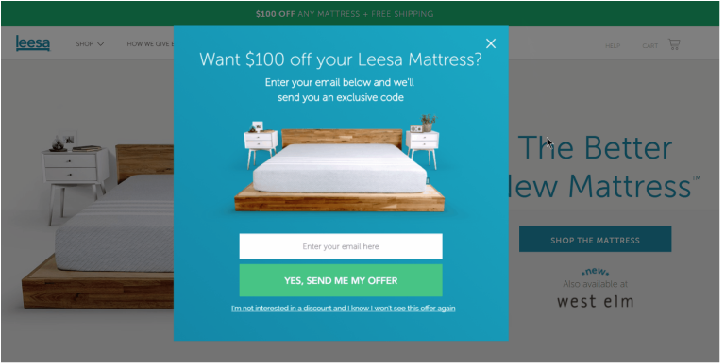
You can find more brilliant popups on Wisepops.
What little extras can you offer?
Arrange a meeting with your colleagues and brainstorm ideas about what you can offer and how to make the last contact with your users more memorable.
6. Learn from the Best Ones
If you do not have a research team, a bunch of testers, UX team or other specialized teams, a very efficient method is to follow the best players in your market or e-commerce.
Bigger businesses have better resources, and they test every inch of their websites and apps, so why not get inspiration for free? :-)
What I recommend is to choose 5–10 websites. It could be 3 leaders in the e-commerce market, 3 leaders from a similar market as yours, and 3–5 of your competitors.
Visit their webs once per month (e.g. the 3rd of every month) and make a print screen of their website - at least the home page, product page, landing page, and all pages from their checkout flow.


Tip: Use the Full Page Screen Capture extension to capture the whole landing page.
Go through the UX changes they have made and consider whether you can capitalize on it in a similar way. If you see anything with the potential of increasing your sales or conversions, make similar changes on your pages.
Please do not forget to use your own judgment. The best approach is to discuss your web changes with experienced professionals. One consultation costs less than a whole team and much less than incorrect implementation.
Contact me via email at ondrej@creativehandles.com or a contact form, so we can analyze your website and increase your business results.
Schedule a free consultation