8 Tips How to Make Users Read Your Articles
11 mins read
To write a fantastic blog post is, as you might know, quite a hard job. The worst part is when the visitor of your web page does not even read it.
Let’s try something different. Use the time you invest in content management efficiently. Try to follow the 8 UX and SEO tips mentioned below, and you will see that you actually can attract more readers to your website for free. The readership of your articles will be higher, meaning that the organic traffic to your website increases and the page ranking of your web will improve as well. It all leads to a higher chance for you to do business.
Even though boosting readership through organic SEO strategy isn’t the fastest way to get your website noticed, it's definitely worth a try.
So here we go -- 8 tips, how to drive traffic to your website.
1. Write Directly to the Point
According to the Nielsen and Norman group study, people read only 20-28% of online content. Crazy, right? It means that they are only scanning the content and catching keywords.
There is a huge difference between how people read online and print content. When reading offline, people do not mind longer articles, and they actually read it until the end. On the other hand, they just scan online content.
Give Users a Quick Answer
Online users are usually searching for immediate answers to their questions. There is nothing easier than to hit backspace and check different articles. They are searching for as many answers as possible in the shortest amount of time as possible. So if you are not able to attract their attention, they will leave within a few seconds.
Read also 4 Types of Eye Tracking Patterns: How People (Don’t) Read on Web
Common Eye-Scanning Patterns
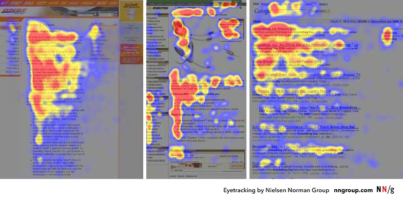
According to the Nielson and Norman Group study, people are pretty consistent in the way they read or scan on web pages. There are several eye-scanning patterns, but the one that is commonly used resembles the letter F.
- Firstly, they read horizontally.
- Then they move a little further down on the page and continue reading horizontally.
- In the end, they scan the left part of the page vertically.
Source: www.nngroup.com
Keywords vs. Creativity
Remember, online readers only want quick responses. So give it to them!
For this, I have a small tip for you. Use relevant keywords. Not only within blog posts but also in titles, and don't get too creative when thinking about headings. Shocking and mysterious subtitles might look sexier and attract more attention, but it is something we expect from tabloids rather than from a professional business. So I would stick to the principle: Don't mislead your readers.
Imagine that you are writing about the struggles of short drivers when driving a car. The headline would be "The Curse of Small Drivers." Does it look appealing? Yes. But would you guess what the article is going to be about? No. So why click on it.
Summary:
- Write directly to the point
- Give a quick answer to the reader's question
- Include keywords in the headline
2. Long-Enough Articles
What article is long enough? Jakob Nielsen states that a short article is a text with less than 600 words, while a long one is 1,000 words and more. Darren Rowse from problogger.com goes even further. Based on his research, a long article includes 5,000 words or more.
So how long should your articles be?
As always, it depends. Eshops can benefit from short, clear texts that are less than 1,000 words. On the other hand, a thousand-word article might not be enough for a specialized SEO website. The best thing you can do is think like your audience -- what do they want?
Blog Posts with 2,000 Words and SEO
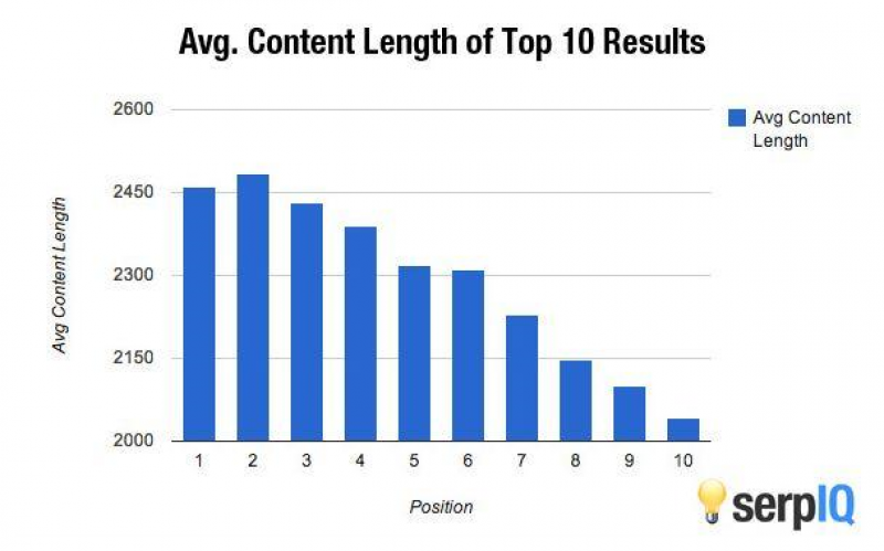
It’s also a good idea to think about the length of articles in terms of SEO. Many SEO experts claim that Google prioritizes texts with more than 2,000 words. However, you should never underestimate the power of the content.
While it’s most probably right, and Google prefers long texts (as we can in the chart below), high-quality blog posts are even more beneficial to your organic SEO and page rank.
Source: www.sweor.com
Summary:
- Know the purpose of your texts
- Consider writing long blog posts
- Ensure high-quality content of your website with a high added value for your visitors
3. Clear Structure
Neatly aligned text, short paragraphs, and standardized length of each line. These are just basics of well-built and organized texts that are preferred not only by readers but also by search engines.
Yes, that’s right. Even something as simple as text editing can get traffic to your posts.
Left-Aligned Texts
There are some cases when texts aligned to the center might work as well. But it’s never a blog post.
Blog posts should always be left-aligned. The readability, as well as the scannability of such a text, will amaze you. Your readers will enjoy the time spent on your website and most probably come back.
Quotations and subheadings are the only exceptions when it might be worth getting a little bit more creative. Their purpose is to break a text into several readable parts, so the center-align perfectly matches this goal.
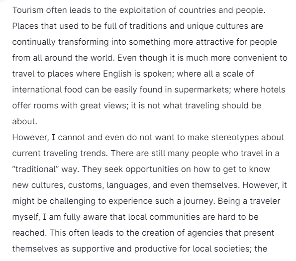
But remember. By all means, you should always avoid the justify alignment. The justified text becomes hardly readable. It’s just a boring wall of text with unpleasantly looking gaps between individual words.
Short Paragraphs
Don’t be afraid to hit ‘enter’ more often than usual. Short paragraphs separate individual thoughts and the content becomes more understandable. “Scanners” whose eyes just fly over your texts will love this organized text as well. The key ideas and the answers are clear enough, and users don’t waste time by trying to orientate on your web.
Highlight Key Ideas
Bolded words are another great method that complies with eye-scanning patterns. The key points are differentiated from the rest of the text. To attract even more attention, you should always add links to your products and services that are mentioned in the text.
What do you think? Does the following text seem catchy to you?
Link to Sources (and Get Links to Your Web)
Make sure that you link all the quoted information to well-known external websites. This step increases your trustworthiness, and even search engines will consider your page more relevant. That’s why link building is one of the favorite strategies to grow traffic to your website for free.
But be careful not to drive traffic from your website out -- to other sites. All links should open in a new window so that you can keep your visitors on your web for as long as possible.
However, links from external websites to your blogs will help you even more. Get your blog noticed. Find relevant partners, exchange links, and grow your audience through this SEO organic strategy.
Text Width Between 50-65 Characters
The text should be neither too wide nor too narrow. Lines that are too long are hard to read, and short ones quickly become annoying. The recommended width of a text block is between 50 to 65 characters.
Summary:
- Align text to left
- Keep short paragraphs
- Highlight key ideas
- Link to other relevant sites
- Keep the standardized length of text blocks
4. Best Font Size for Your Website
What is large enough for you might not be enough for others. Tiny fonts are difficult to read. So on the website, the larger and clearer font you use, the better.
Font Size at Least 16px
The smallest font size you should go for is 16px. Anything smaller will make your readers feel uncomfortable and most likely to leave within a few seconds. The only exception for small fonts is image descriptions, sources below charts, etc.
Font size 24px
Font size 20px
Font size 16px
Font size 14px
Font size 10px
Font size 8px
Also, consider the readers of your blog. How old are they? The older people are, the larger font size they need. Not sure? Go to Google Analytics, click Demographics, and select Age.
Here, you can see different age groups to which your visitors belong. In case you can’t find the information there, you must set it up first. Simply click on the “Activate” button, and Google Analytics will start collecting these data from now on.
In general, Google Analytics is a great platform where you can check website traffic and all relevant information for free.
Summary:
- Keep the minimal size of font 16px
- Consider the age of your readers
5. Legible Typography
Choose your font carefully. The proper website typography isn’t about creativity. The most crucial factor you should consider is the legibility of fonts and texts on your website.
As for headings, here you can ‘play’ a little bit and choose something less conventional. However, use a case-sensitive font to make it easier for users to scan the text.
For the article itself, use one of the ‘basic’ fonts. The ones that were tested by UX designers and are commonly recommended are Arial, Open Sans, Roboto, Courier, or Verdana.
How easy is it to read this text?
And how about this one?
Ideally, don’t use more than two different fonts per article -- one for headings and the other for the block text. Maybe, you can add one more for subheading and quotations but that’s it. Too much creativity never pays off in UX.
Summary:
- Choose easy-to-read fonts
- Don’t get over creative
6. Contrast Between Text and Background
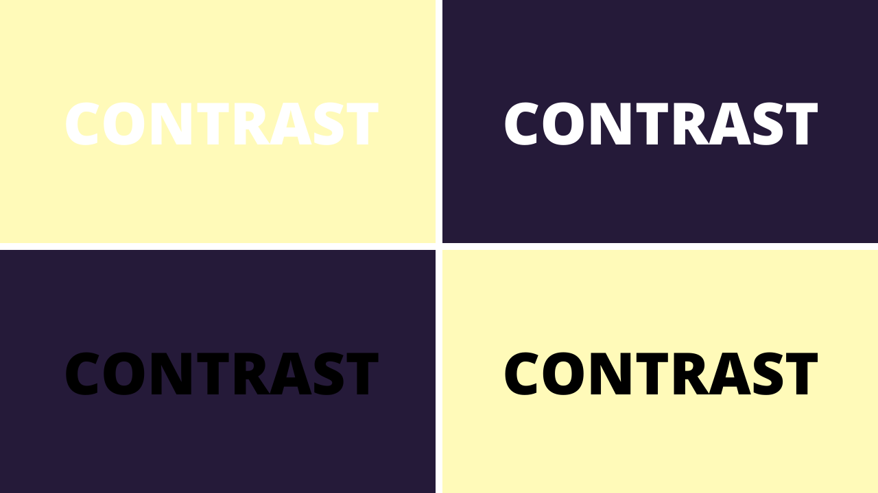
Fortunately, the trend of colorful backgrounds and texts on web pages is gone. Unfortunately, some websites haven’t said the final ‘goodbye’ yet. It’s not only annoying to read; for example, yellow text on a white background, it also becomes an impossible task.
Why make it hard for your readers? Let them enjoy your texts.
Maintain the contrast between background and text -- ideally dark text on a light background. If black color is too dull for you, use other black variants, i.e., gray, gray-blue, gray-green, but always make sure the contrast is high enough.
It’s also what I recommend. Slightly adjust your dark text to other tones than the black one (HEX: #000000, RGB 0,0,0). Your texts will look subtler and enjoyable.
Keeping the ideal contrast is also important in terms of action buttons. Call-to-action buttons are the parts you don’t want to be missed, so make sure that the text is visible and legible.
Summary:
- Keep contrast between background and texts
- Check contrast of call-to-action buttons
- Think about colors used in action buttons
7. Call to Action
Now, visitors enjoy your text and read your blog posts until the end. Even though it’s a great result that should be celebrated, there is one more step. You not only write the texts for visitors but also yourself.
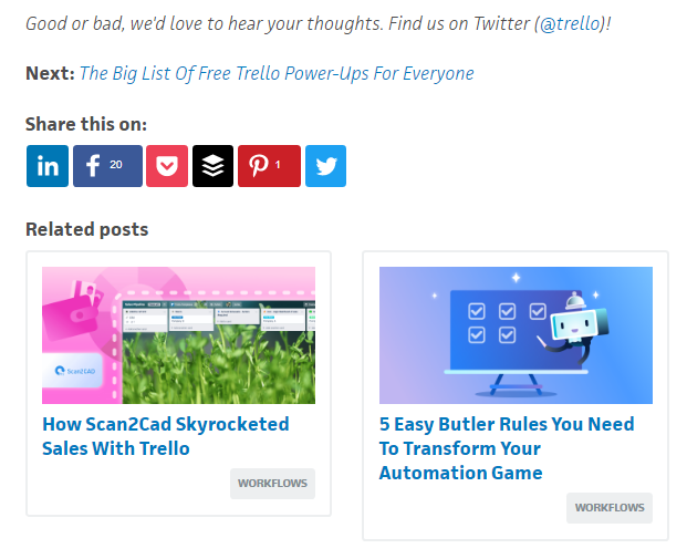
Make your readers coming back -- show them you have more to offer. Motivate them to buy your products or try your service. Navigate them to the next step in the purchasing process -- either through links or a contact form at the end of the article.
Source: Trello.com
8. Frequency of Blog Posts
How many posts per week? How often to publish new articles? These questions are asked over and over.
Consider Your Capacities
Even though a blog can make a huge difference and support your business, it might also harm you. You don’t want your visitors to see that the last blog post was published five years ago.
The rule of thumb here is -- try to publish regularly based on your capacities and goals of your texts.
Do you have anybody to take care of your blog, or will you do it by yourself? Do short, clear texts support your business plans better, or should you work on long, high-quality articles? Would you be able to post this kind of articles every week?
After you answer all these questions, you should be able to plan the frequency of your blog posts. Now, think about the topics.
Prepare a List of Topics
Write down a list of topics for your blog posts, ideally for the next year or at least 6 months. Be creative, involve other team members, and you will be amazed by how many topics you can think of during this brainstorming. Create a content plan and keep following it.
Summary of Key Points:
- Write straight to the point. Remember, people don’t read but scan your content.
- Adjust the length of your posts to your business goals. Keep the quality and improve your SEO.
- Consider producing blog posts longer than 2,000 words.
- Be clear and organize your texts. Left-align texts, short paragraphs, the ideal width of block texts, highlighted key information, and link building are so essential.
- Set the smallest font size for 16px. Check the average age of your visitors.
- Choose legible fonts such as Arial, Open Sans, Roboto, Courier, or Verdana. Keep them consistent, and don’t overdo it with creativity.
- Make your texts and background contrasting enough. Texts must be legible, especially in call-to-action buttons.
- Take your readers to another step. Use call to action strategies.
- Prepare a content plan. Think about relevant topics for the next few months.
What Next?
Are you interested in growing traffic to your business website? Drop me a message at ondrej@creativehandles.com, so we can discuss the best strategy for your business. Or fill this contact form and we will get back to you with a 30-minute-long free consultation.
Schedule a free consultation
Ondrej Lang
Managing Partner & Growth Hacker
Finalist of the Startupper of the Year 2019 in the Czech Republic. SDGs Czech 2019 winner with Mavimi. Winner of Masters Gate CZE 2017 in the category of small and medium e-shops with Raj kovani. Ondrej helps companies grow faster, thanks to hacks and digital opportunities. Do you want to grow faster? Write to ondrej@creativehandles.com.

