Error Page 404: Turn Back Your Lost Customers
8 mins read
The error page is an essential part of every website, and it would be a mistake to underestimate its importance. If the error page is done correctly, it has enormous potential and can increase your sales.
What should the "correct" error page look like and contain? Find the answers, tips, and examples in this article.
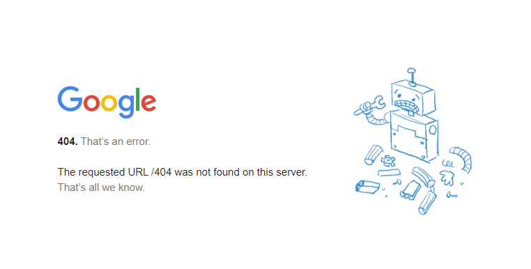
Source: Google
Why 404 Page Appears?
The reason for getting a 404 page error is that a user tries to access a page that doesn't exist. Why doesn't the page exist anymore? There are multiple reasons:
Change in URL: The page has been moved to a new URL, but its original URL address hasn't been redirected.
Deleted page: Even though the page has been deleted, it still exists (it's indexed by search engines, so you can still find it in search results or access it via links from other sites/pages)
User error: Users often make a typo and try to navigate to a wrong URL address, e.g. creativehandles.com/block (there is no such a page on our web)
Tip: Do not change the URLs of existing pages unless it's absolutely necessary. And if you do so, don't forget to redirect them from the original (now throwing 404 mistake) to the new one.
Error Page on Your Web
If you use WordPress and have never set up an error page, visitors to your site will get to the infamous "page not found" white blank page. As you may have guessed, this doesn't seem right. Your customer will likely get confused and leave the page.
Source: SuzanneCollinsBooks.com
As for custom websites, it's a bit different. The web designer probably prepared a great design of a 404 page, and the programmer coded it. But is it right? It depends...
Very often, I come across beautiful and personalized 404 pages that are absolutely useless.
All the attention during development is directed to the homepage, and the error page is often overlooked. But think about it. What are your conversions from the homepage, and how many customers do you lose because of a poor error page?
Why and How (Not) to Solve Error Page
A website without an error page doesn't exist. Even if you never set it, in case of an error (for the reasons mentioned above), a user would get to a white page "page not found." A 404 error in the least user-friendly design.
This format of the error can negatively affect your website. Let's say a user intends to purchase your product. They click on the link, and instead of the expected sales page, they get a helpless error message. What now? The confused user is leaving and most probably won't return to your website anytime soon.
Source: Basecamp.com
An incorrectly set error page is also "punished" by browsers such as Google. Websites with a high bounce rate seem unreliable, and the algorithm evaluates them as unmaintained. It leads to lower rankings and displaying your page in lower positions in search results. Attracting customers to the web organically (without investing in ads) will become more challenging and, in the end, almost impossible..
In a nutshell, the absence of a properly made and customized 404 error page is bad for your SEO as well.
Saying that, you don't want to get rid of the error pages. Instead, you should investigate the reasons why this page displays and prevent these mistakes from happening.
How to Find Error Page on Your Web
But how can you know which pages are out of date and lead to the 404 error message? There are several tools (paid and free) you can use to detect them. After they analyze your site, they show a complete list of 404 pages and links that lead to them. While new or small sites should have a few links on the list, larger websites or e-shops can have dozens of broken links. There is no need to try to solve all of them. Instead, focus on those pages that have the highest traffic.
Google Search Console
Google Search Console (GSC) is part of Google's suite of tools available for free. This tool is a must-have for every website as it is a great helper when indexing new pages, analyzing organic traffic keywords, and, above all, detecting 404 errors on your site.
Source: personal archive
Google Analytics
Google Analytics (GA) is a popular free analytics tool. Finding a 404 error using GA is more complicated than in the case of GSC. In order to use GA, you need to set up the title of the error page correctly. The title appears in the browser toolbar next to the favicon. If the error page name is unique (for example, Page Not Found or 404 Error), you can use GA to find it.
Source: personal archive
If you have everything set up correctly, you can easily find out how often an error page appears on your website and how visitors get to it. Unfortunately, it often happens that the name of the error page is the same as the homepage name. In this case, GA can't differentiate between the two and won't help determine 404 errors on the web.
Online tools
You can also use any of the 404 checkers or broken links tools available online to analyze 404 errors. They scan your entire web, often including images, categories, or products, and quickly find out which pages or elements of your web report errors.
Source: Ahrefs
Screaming Frog
Screaming Frog is a tool popular among SEO specialists. Even though it's paid, a limited version is available for free (and should be enough to analyze a smaller site). It works similarly to other checkers, but its reports are more detailed and focused mainly on errors from the SEO point of view.
How to Fix Error Page
Once you put together the report of broken links on your website, your task is to reduce their number as much as possible. Import the list of error pages into an excel file and add new addresses to each broken link. This way, you can redirect users from old broken URLs to other up-to-date pages.
When you finish, ask your programmer to do the redirection. They will probably use the 301 (permanent redirect) protocol as it keeps the SEO of the previous page.
Try to avoid redirects to the homepage. It not only confuses users but worsens your SEO.
Tip: If you redirect the entire site, use the services of an SEO specialist who will correctly evaluate every step of the process and avoid unnecessary 404 errors.
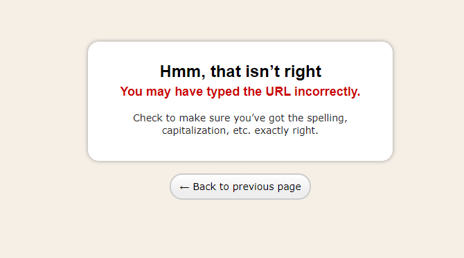
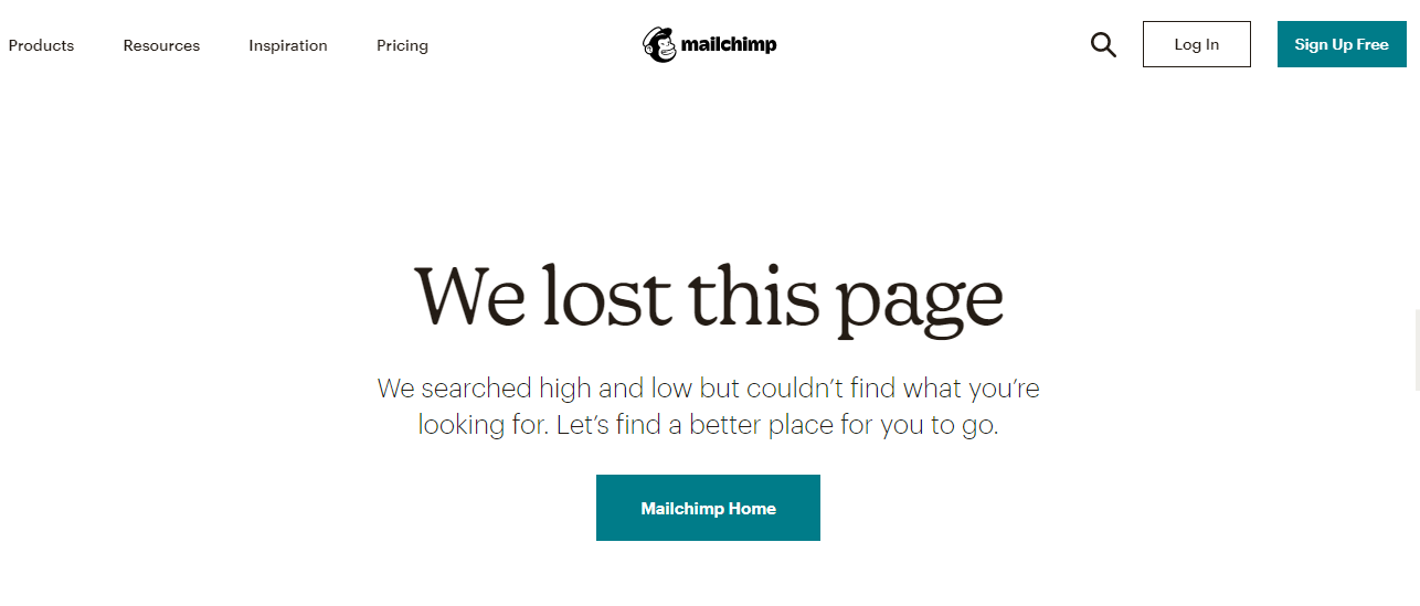
Source: Mailchimp.com
Must-Haves of Each Error Page
It doesn't matter if you own an e-shop, a small website, you work in the B2B or B2C sector. Every error page should follow a clear structure. How should a good error page look like to keep your users engaged and turn them to your clients?
According to Nielsen Norman Group there are 3 necessary factors for a business-oriented 404 page:
1. Use clear language
- You talk to people, so use a language that your customers will understand. Nobody cares about codes and abbreviations.
2. Explain what happened
- Provide reasons why users came to the error page. It may be due to a typo in the URL, so let them know. But in any case, don't blame your users for a mistake or, even worse, make fun of them.
3. Offer a constructive solution on how to proceed
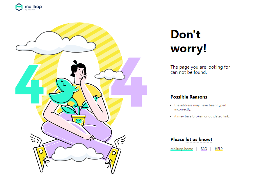
Source: Mailtrap.io
Best Practices for Creative Error Pages
As you know, the error page doesn't have to be boring. Playful and functional 404 pages are an excellent tool for engaging visitors. How to get the most from your error page? Check our video or continue with the article. :-)
Creative Message
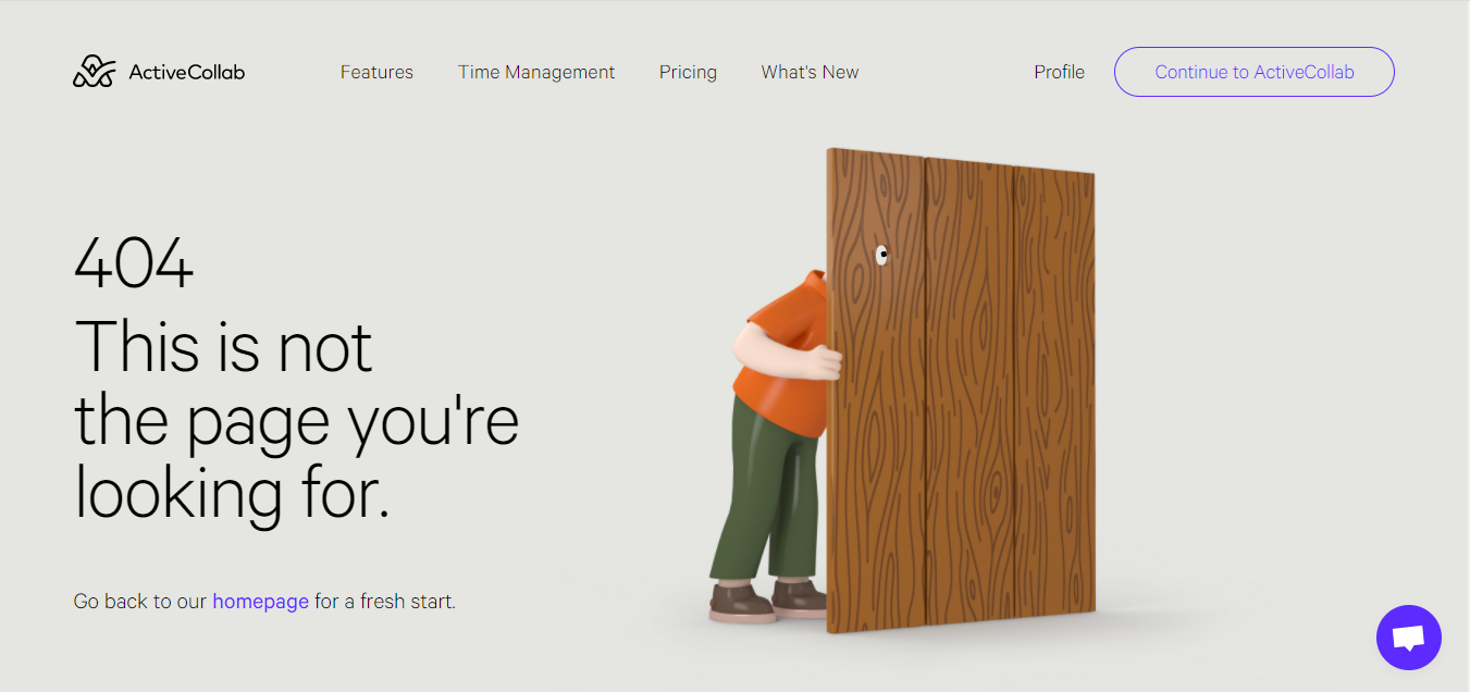
Understandable does not mean vague. On the contrary, lighten the situation and show the user that it is worth staying and purchasing your products or services. Images or graphics customized to the overall design of your website work great.
Source: ActiveCollab.com
Search Function
Do you have a large website with thousands of URL addresses? Make it easier for the user to find the information for what they came. Thanks to the search, a user gets to the intended page quickly and hassle-free.
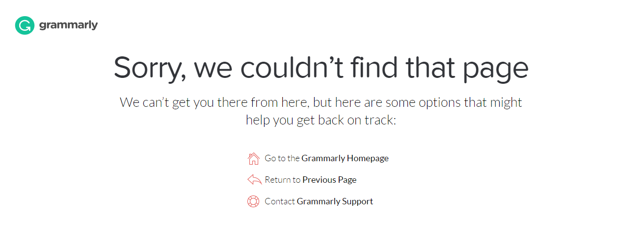
Suggested Pages
Do you organize webinars, events, or want to notify about news on your website? Show the user that you have something to offer. Place links to your key pages on the error page.
Source: Grammarly.com
Contact Form
If you restructure the entire web, you may forget about some pages and not place a visible link anywhere in the menu. Thanks to a contact form, users can contact you and inform you about the missing pages they were looking for. Chat also works great and allows you to provide an immediate answer.
Small Extras
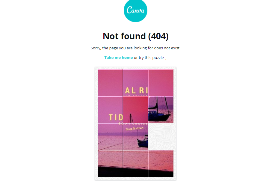
The error page - no matter how well it is designed - is a complication for the user. So it's fair to think compensation for this inconvenience. You can offer, for example, a voucher or a discount on the purchase. Or maybe just a play-time.
Source: Canva.com
Translations
Don't forget to translate the error page if your website is multilingual. Great creative advice in your local language won't please English-speaking customers.
Source: MDlogistika.cz
Visible Menu
Let users decide. A visible menu or a header with a footer allow users to navigate where they want to go. You might be surprised, but it's not always a homepage.
Summary
Stand out from the competition and embellish your error page down to the last detail. It will convince users who wander to this page not to leave and try out your services or products.
Drop me a message to discuss how to create the best 404 error page, a website, or application.
Schedule a free consultation
Ondrej Lang
Managing Partner & Growth Hacker
Finalist of the Startupper of the Year 2019 in the Czech Republic. SDGs Czech 2019 winner with Mavimi. Winner of Masters Gate CZE 2017 in the category of small and medium e-shops with Raj kovani. Ondrej helps companies grow faster, thanks to hacks and digital opportunities. Do you want to grow faster? Write to ondrej@creativehandles.com.

