10 Tips on How to Build the Best Landing Page
5 mins read
Have you ever clicked on an attractive ad and landed on an irrelevant page? Or even worse, got lost? Unfortunately, this happens all the time, and the reason is quite simple – a bad landing page.
Great landing pages are essential for every marketing campaign. It is the first touchpoint for new visitors. Hence, it should be simple and always focused on one goal. Your homepage usually doesn’t meet these criteria, and that is why you should never start an advertising campaign without a dedicated landing page!
So, what do you do to increase your conversion rate? Check out our tips.
1. Stick to Your Campaign Goal
What is the primary purpose of your advertising campaign? Do you intend to sell a product or just obtain contact information? Set your goal and make sure that your message is aligned with that. If your ad says “Master data science”, it should also appear on the landing page to match people's expectations.
2. Keep the Design Simple
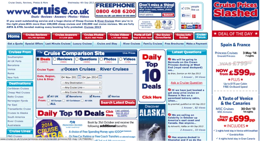
The simple design is an absolute must! Therefore only include essential information and give it a clear structure; otherwise, people get lost and frustrated. Take a look at the picture below – how would you feel ending up on this page?
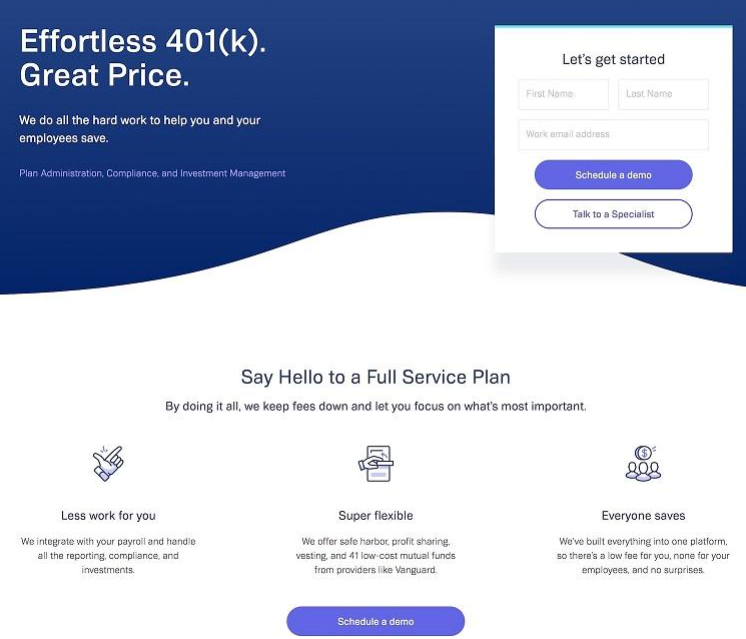
Use visual indicators such as arrows and shapes to navigate visitors from the main message to the call-to-action button. Speaking of which, make sure your CTA button actually looks like a button. That means people know they should click „here“ to buy your product.
3. Use Straightforward Copy
“More is less” also applies to the copy. Don’t forget to focus on your goal and keep the message short and clear. Use bullet points, headers, and subheads, and headings should be aligned with the ad that brought visitors to this page.
Are you happy with your copy and CTA? Make more versions, test them and compare the results to each other. You never know what resonates the best with your audience.
4. Remove All Distractions
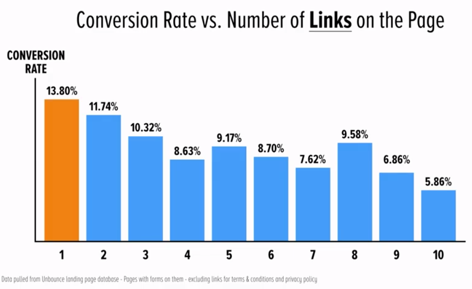
I must have said this about a hundred times by now, but it is crucial to remove all unnecessary features to avoid distraction. Remove site’s navigation, social media buttons, or links to your homepage and focus on a single goal with a single CTA. Try to keep your attention ratio 1:1.
Source: youtube.com
You can see in the chart above how fewer links increase the conversion rate. The ideal number of links on the landing page is... one. How is it possible? This is why.
Source: youtube.com
5. Keep the Action Above the Fold
You have only a few seconds to attract visitor's attention, so you want the most critical stuff to be visible first. Put the key message and the CTA button to the upper part of your website, so it's perfectly visible before scrolling down. Below the fold, you can place testimonials, case studies, logos, or some additional info.
Source: wordstream.com
6. Use Social Proof
Let’s say you have done everything we went through so far. The potential customer clicked through your ad and is now thinking about purchase. However, how does he know that your product/services are of the same quality as promised?
Use testimonials, reviews, or case studies to increase your credibility and resolve objections. But how to make these reviews trustworthy? Use as many personal details as you can: picture, name, job title, date of purchase, etc. You may also connect your landing page with various platforms such as Yelp or Google My Business that will keep your reviews fresh, and it‘s clear they haven’t been created just for this advertising campaign.
Social proofs are something extra, and you should place them at the bottom of the page.
7. Design for the Right Device
People are browsing using all sorts of devices these days. Be it a desktop, mobile phones, or tablets. According to StatCounter, 50,34 % of all website visits are made from mobile phones. Desktops follow with 46,67 %. Therefore, make sure your landing page is mobile responsive. Adapt the content for a smaller screen, don’t use too many interactive features, and keep in mind that videos can be data-consuming.
8. Speed Up Your Loading Time
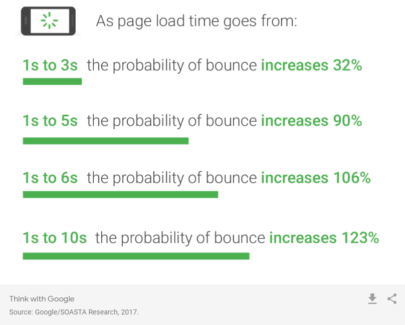
Time is money, and people are impatient. Your page must load fast, ideally under 3 seconds, as after that, most people bounce.
Source: thinkwithgoogle.com
According to Kissmetrics, 47 % of consumers expect a web page to load in 2 seconds or less, and 40 % of people leave a website that takes more than 3 seconds to load. A 1-second delay in page response can result in a 7% reduction in conversions. Amazon did a study and found out that they lose 1 % of their revenue every second delay their website loads. Too bad, right?
And how exactly can you speed uploading your website? Firstly, get familiar with Google PageSpeed, which shows you what to fix to improve your speed. The majority of your traffic will come from mobile devices; therefore, consider using Google AMP framework to help your content load in an instant.
9. Better Test than Sorry
To be sure that our audience hears exactly what we are saying, make a 5-second test. Randomly select a few representatives from your target group and show them your landing page for 5 seconds. Then ask them questions about what you offer. Did they get it right? You can also use a handy online tool Usability.
Another useful tool is heatmaps. They will help you find out if people look and click on the right places.
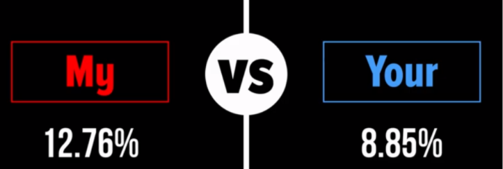
Last but not least is A/B testing. Try to test more variants. Even the slightest change can result in a massive increase in conversion rate. What do you think about these two CTA phrases?
Get MY ebook
vs.
Get YOUR ebook
Would you believe replacing “my” with “your” can make a big difference?
Source: youtube.com
Yes, it had a huge impact! Conversion rate decreases by 45 % in the case of the word “your”.
10. Update Regularly
This should be absolute basics for every advertising campaign. Make sure your page is always up to date. You don’t want to sell something that you don’t even have anymore, right?
Summary
Never start an advertising campaign without a dedicated landing page! When you will create it, think about these 10 points:
- Stick To Your Campaign Goal
- Keep The Design Simple
- Use Straightforward Copy
- Remove All Distractions
- Keep The Action Above The Fold
- Use Social Proof
- Design For The Right Device
- Speed Up Your Loading Time
- Better Test Than Sorry
- Update Regularly

