4 Types of Eye Tracking Patterns: How People (Don’t) Read on Web
8 mins read79% of users only scan your text
It will not please you. Especially those of you who play with every single word in your articles might be disappointed. Your readers don’t care. In the online world, people don’t read word-by-word. According to Nielsen Norman Group, 79% of users only scan the page or screen.
I know how bad it sounds, but honestly, there is no reason for frustration. Quite the contrary.
Once you understand the scanning patterns that you should incorporate into your website, you hit the jackpot. Based on models along which users scan your web, you will be able to place important and relevant information exactly at the points your users pay attention to.
The well-scanned structure of the content is tremendously essential and should not be taken lightly when designing a website. In general, pages with a layout that can be scanned easily, have a lower bounce rate, readers can easily navigate in the text, and find what they came for -- answers to their questions.
Scannable content impacts conversions and website usability as well. Users who understand how to perform their intended activity much faster, are willing to do so. And that’s exactly what every UX and usability designer aims at.
Honestly, people have better things to do than read your website. If the structure isn’t clear enough from the beginning, your reader leaves to your competitor. According to David Zheng, 60% of visitors spend less than 15 seconds trying to orient on your web.
So what the main benefits of a well-scannable website are:
- Better user experience = better conversions
- Positive effect on SEO = better organic search results
- Lower bounce rate
And now, let’s get into the tips on how to incorporate eye-tracking patterns into your text.
What are the common reading patterns for websites?
Source: Nielsen Norman Group (edited)
F-Shaped Reading Pattern – Shape of Letter “F”
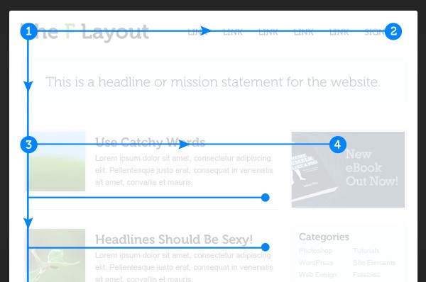
F-shaped scanning pattern is one of the most common ones. Readers, searching for a quick answer to their query, focus on several first sentences of a text. In cases they don’t find their answer or the text isn’t engaging enough, they don’t continue in word-by-word reading and start scanning the rest of the content.
Users start moving down the page, fixing their eyes on the left side of the content. They read some of the initial words per line to figure out whether the text has anything relevant to offer. After a while, they start to read again but usually stop around the middle of a line. This shorter horizontal area reminds a lower bar of a letter F.
Now, your readers get bored.
They still give you the last chance and scan the left side in a vertical movement. Unless they find what they were searching for, they reach the bottom of the page. This scanning movement is the last element of the F-shaped pattern you can see in heatmaps.
Source: webdesign.tutsplus.com
The resemblance with the letter “F” is rarely perfect. Sometimes, eye movements are more systematic and create a solid shape. Other times, users move faster, and the heatmap gets spottier. Also, they can get attracted by some words and actually read some parts of the text.
However, all of these styles meet 3 basic characteristics of the F-shaped reading pattern.
- The first lines of the texts attract the most.
- The first few words on the following lines receive more gazes than the rest of the sentence.
- Most of the text is skipped.
The F-shaped pattern is also heavily influenced by the way we read. In western cultures, we read from up to down and from left to right. Interestingly, the F-pattern works for Arabic text as well, but in this case, it’s reversed (horizontally flipped).
Readers’ Response to an Unclear Text
We should always keep in mind the selective culture of reading. Most of the users don’t come to enjoy reading your posts, they come because they want to solve their issue. Whether it’s getting information as fast as possible, checking a product, ordering some services, your content is hardly ever their priority.
So, what are the common reasons for F-scanning?
- Wall of text - no subtitles, images, words in bold, nothing that would break the text into some organized parts. Proper formatting will do the magic here.
- Busy reader - don’t waste the time of your users and give them their answers.
- Non-engaging text - first impression (sentences) was bad, but they still try to give you a second chance and scan the rest of the content.
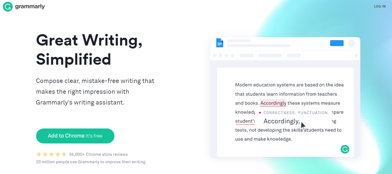
The f-shaped structure of texts also often appears on modern landing pages where we want our users to get all the essential information. Short but appealing texts in a form of "F" letter don't give any other choice to readers. Whether they want or not, they will unconsciously read it all.
Grammarly.com
Spotted Pattern – Fixation on Specific Elements
Contrary to the F-pattern, this time, a visitor doesn’t start reading the first sentences. He or she only focuses on specific elements that are spread throughout the page layout.
Grab Users’ Attention
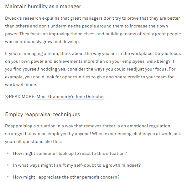
Elements that stand out in the text are usually visually different -- bolded words, bullet lists, or links. Other pieces of content that attract more attention are digits and words with capital letters. But it always depends on the purpose of the visit.
Grammarly.com
Layer-Cake Scanning Pattern – Power of Headings
Similarly to a child at a birthday party, readers tend to skip the dry corpus of the cake (wall of text) and enjoy much tastier topping and frosting (headings and subheadings).
Really. Nobody wants to spend time reading irrelevant non-engaging paragraphs, and the layer-cake reading pattern is a great way out of it.
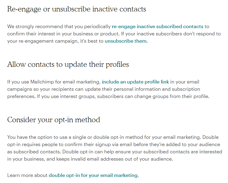
Headlines provide readers with an insight of what is discussed on the following lines. Once, it’s relevant to them, they start reading the whole paragraph.
Headings with Keywords
What does it mean? Don’t underestimate the power of headings. By giving proper direction on what the following text is going to be about, even “scanners” won’t miss the information they are looking for.
But don’t get too excited as well. The ideal length of a heading should be around 60-80 characters, and there is no reason to reveal all your cards.
Relevant word choice also positively influences your SEO -- your content will be more understandable for both users and search engines. Find more information about how to write for readers and search in 8 Tips How to Make Users Read Your Articles.
Mailchimp.com
Commitment Pattern – Proper Reading
Motivated or very interested readers are actually the only ones who demonstrate the traditional reading as we know it from schools. They don’t scan but carefully fix their eyes at almost every word in the article.
Such a reader can even try to overcome challenges such as a wall of text, but it doesn’t mean we shouldn’t try to lessen his effort by proper formatting. Overall, we still want our readers to enjoy our texts, don’t we?
It will take a long time for a reader to finish an article, so credibility is a must. Your website must demonstrate reliability, so users can trust the information without searching for verifications on other sites.
Do Your Best
According to Nielsen Norman Group, only 16% of readers are committed to reading your text if they come to your website for the first time. The other 84% first scan the content, analyze the relevance and trustworthiness of your brand.
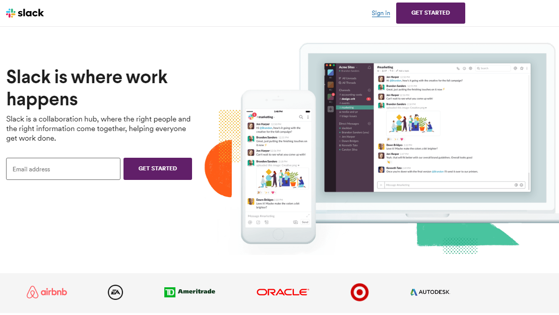
Don’t forget that users pay attention to the overall image of your web/brand. They analyze every detail of the layout, scannability, and headings. They also try to identify any suspicious elements that might push them to leave. Unclear, unorganized texts with hundreds of types of formatting, excessive animations from 90ties, and free domain are some of the reasons why visitors might doubt your credibility.
Take a look at Slack for example -- from the first moment you feel that this is a site you can trust.
Slack.com
Summary
It’s important to realize that a vast number of factors influence human behavior. Even though I just described the common scanning patterns on websites, it doesn’t mean your readers can’t follow (even random) scanning models based on their previous experience on your website, their motivation or specific goals they try to achieve on your page
Content Management in Its Fullest
Now, you can see that writing and publishing excellent articles are quite complex tasks. Not only should you choose your words carefully, when you write, edit, or format the text, but you should also always keep in mind the factor of scannability.
Remember:
- The visual hierarchy of your page is your priority.
- Divide long paragraphs into shorter ones.
- Follow basic content strategies.
- Use headings, subheading, bullet points -- all the things that stand out in a text.
- Bold the key ideas.
- Work on effective call-to-action buttons.
And overall, make the user experience as good as you can. It’s the only way to guarantee that your readers will come back again.
Feeling overwhelmed? Contact us and I will be happy to assist you with web design and strengthening user experience. Simply fill this form and get a 30-minute-long consultation as a bonus. Can't wait to hear from you.
Schedule a free consultation
Ondrej Lang
Managing Partner & Growth Hacker
Finalist of the Startupper of the Year 2019 in the Czech Republic. SDGs Czech 2019 winner with Mavimi. Winner of Masters Gate CZE 2017 in the category of small and medium e-shops with Raj kovani. Ondrej helps companies grow faster, thanks to hacks and digital opportunities. Do you want to grow faster? Write to ondrej@creativehandles.com.


