Get New Clients by Improving Accessibility of Your Web
7 mins read
More than 15% of the population are people with disabilities. Your customers are among them.
You got a great website. Beautifully designed, optimized for search engines, it makes happy both users and search robots. But aren't you missing something? Is your web accessible to everyone without exception?
Rarely do entrepreneurs think about how and whether their website suits disabled users. However, doing things online is for most people with disabilities easier than in a real offline world. Thanks to various technologies, they can do things independently without the help of an assistant. Actually, can they? Not really, as many websites aren't accessible.
Whether the users leave with frustration from various obstacles that prevent them from smooth navigation on your website or they successfully finish their intended activity and for example, buy your product, it depends only on the quality of your website.
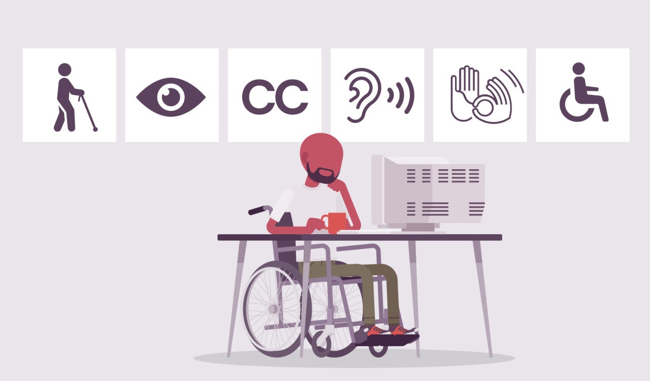
Source: 99designs.com
Is Web/Mobile Accessibility Important?
Mobile or web accessibility means that a website, app, or tools are designed in a way that enables people with disabilities to easily navigate and use them. Why web accessibility matter? If I haven't convinced you about the importance of web accessibility yet, here are 5 reasons why accessible pages are important from the business perspective as well.
- Losing customers with disabilities.
- Globally, over 15% of the population suffers from a disability. Most probably your potential clients are among them.
- Missing out on seniors
- Navigating on a barrier-free website is also easier for seniors
- Legal requirement
- In some countries, such as the US, accessibility is required by law for all websites and mobile applications.
- Better web performance
- SEO (Search Engine Optimization) and web accessibility are related. Disadvantaged users leave the inaccessible site quickly, which search engines, like Google, don't like and consider your web as a poor source of information.
- Better UX
- Accessibility improves the overall user experience (UX) for every visitor to your website. Just think about how many people appear in one of the following categories in their lifetime.
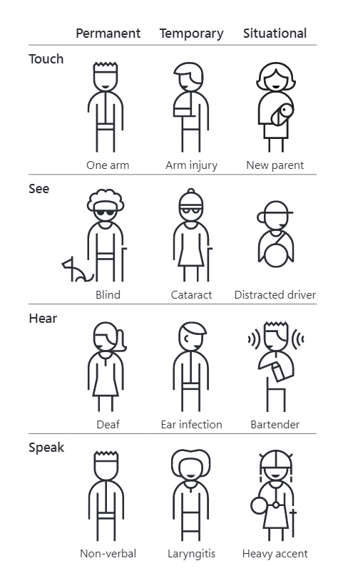
For example, in the United States, 26,000 people suffer upper limb loss each year. But if we include people who can't use one hand, whether, in the short or long term, there are more than 20 million of them. (Inclusive toolkit 101 – Microsoft)
Web Accessibility Rules
Web Content Accessibility Guidelines are globally recognized standards for creating an accessible website. The individual measures are divided into four thematic principles - perceivable, operable, understandable, and robust. Each of them contains several specific criteria, which also fall into three levels: A, AA, and AAA.
- Basic level A – "Must have"
- The basic level has the highest priority, and its conditions are easily achievable. If you ignore these terms, your content will be entirely inaccessible to specific groups of users.
- AA level – "Should have"
- Achieving intermediate level AA is a bit more challenging than the basic level, but it removes serious inaccessibility barriers that cause challenges when navigating on the website.
- The highest level of AAA – "Good to have"
- By implementing AAA-level measures, you get the best result – a fully accessible website for users with various disabilities. These measures can be more expensive or hard to achieve. It all depends on your goals and abilities. (Master.cz)
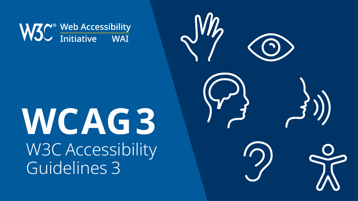
Source: w3.org
How to Immediately Improve the Accessibility
In the following paragraphs, I want to present practical tips that will enhance the accessibility of your application or website. For a better understanding, they are divided into groups according to the principles of WCAG (perceivable, operable, and understandable), and mostly belong to A criteria.
Perceptibility
Users must be able to perceive the information presented. They cannot be invisible to all their senses.
Contrast
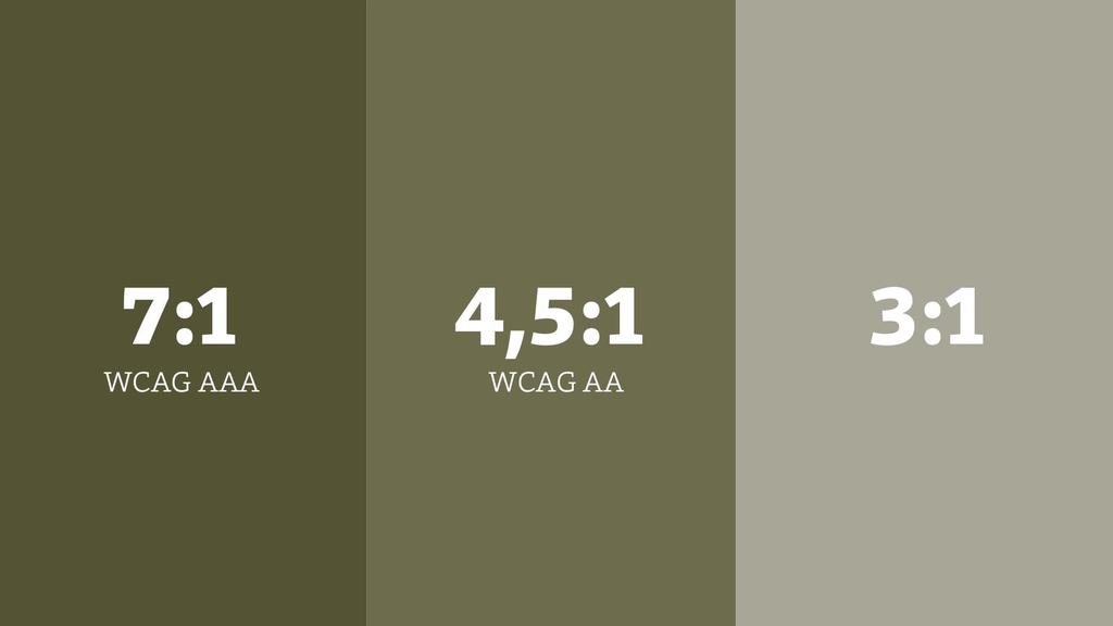
Sufficient contrast is really important. To achieve higher readability of information on your website, you should use a 7:1 ratio (which complies with the AAA accessibility criterium).
Source: vzhurudolu.cz
In the picture, you can see the differences between the individual levels according to the accessibility rules. The 3:1 is often considered as a minimum contrast ratio in texts.
Tip: Test the contrast on your web. Use the Contrast Checker to see if the colors are contrasting enough
Colors
High contrast isn't sufficient though. Some users can't differentiate particular color shades from each other or can't perceive them at all. Therefore, never rely only on the differentiation of critical information using the color scale; add other elements as well.
Source: master.cz
This "improvement" is a great help for black and white printing as well.
Alt tags of images
The correct use of alt tags is crucial to preserve the meaning of the images for those who can't see them. And why do I emphasize the word "correct"? Isn't it enough to include alt tags in the HTML code?
It is enough but it's essential to use sufficiently descriptive text. There's a difference between a squirrel or a squirrel on a tree. That's why always try to describe the essence of the image so that users don't miss any context or essential information.
Alt tags aren't important just for visually impaired users. Everyone can see them when images can't be loaded. Another benefit is that correctly set alt tags can improve your position in search engines. That's a nice "bonus", isn't it?
Video subtitles
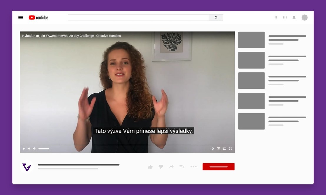
When it comes to videos, you can increase their accessibility by rewriting them or adding subtitles. Although this recommendation is more time-consuming, it makes your website more accessible to a wide range of the public. Some visitors don't have the opportunity to play the video with sound on or speak another language.
Animations
Animations that flash more than three times per second can cause seizures and shouldn't be displayed on websites at all. Also, a visitor should have the option to hide or pause elements that move, blink or rotate.
Source: levelaccess.com
Operable
Users must be able to control the interface. In other words, the interface cannot require an action that the user cannot perform.
Keyboard navigation
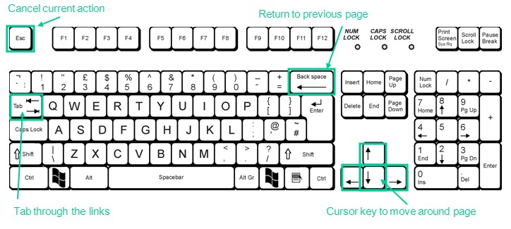
Many users browse the Internet using their keyboards. Some of them (such as the blind, partially sighted, and physically disabled) can't navigate on a page with a mouse. If the web doesn't allow users to use the keyboard, it becomes inoperable.
Source: disabledfriendly.weebly.com
Another problem occurs when users don't see which element (link, button, field on the form ...) they have selected. To test it, you can go through your website using a tab and quickly find out if you would orientate without much difficulty. If not, you need to define the attribute :focus on the selected elements correctly. It's possible that highlighting is turned off (outline: 0 or outline: none). It only takes a moment to set it up, but makes a huge difference.
Tip: For more information on this topic check outlinenone.com
Accurate hyperlinks description
Various reading devices for disabled users allow displaying only hyperlinks without the surrounding text. If an anchor text (the visible characters and words that hyperlinks display) is a general text: read more, more information, or perhaps click here, a visitor struggles to understand the context.
Don't forget to check How People (Don't) Read on Web. Click here.
vs.
Don't forget to check How People (Don't) Read on Web.
Avoid underlining to highlight some parts of texts. This confuses users as underlined texts are generally associated with hyperlinks.
Understandable
Users must be able to understand the information and operation of the user interface.
Structured text
Your target audience should quickly understand what you want to tell them. It is also vital to preserving a particular text structure, such as paragraphing, avoiding long sentences, and typography to attract and keep the reader's attention (font size, color, bold, etc.).
Want users to read on your web? Make sure to check 8 Tips How to Make Users Read Your Articles
Heading hierarchy
Thanks to several levels of headings and subheadings, the page's structure can be understood even by a person who can't see it. As a result, they can easily find the section that interests them.
Did you know that search engines partially evaluating the relevance of pages based on heading? Placing keywords in headings can increase organic traffic.
Recommended layout:
- Level <h1> is used for the main title on the page.
- Use <h2> to highlight subheadings.
- Use levels <h3> to <h6> to indicate additional subheading levels as needed.

To improve web accessibility, it's essential to avoid skipping heading levels, so users with screen readers can easily navigate on the page.
Error alerts in forms
Nielsen Norman Group mentions three crucial principles for reporting errors in forms that improve the overall UX (user experience).
- The error message should be easy to notice and understand.
- The field(s) in error should be easy to locate.
- Users shouldn't need to memorize the instructions for fixing the error.
Source: nngroup.com
The importance of an accessible website
Web accessibility is a growing topic, and entrepreneurs shouldn't underestimate it when developing a website or application. Making a website accessible is an investment that will pay off not only in terms of better search rankings (SERPs) but also by opening the door to new customers.
At Creative Handles, we consult features of accessible websites during the first consultation of your project. Contact info@creativehandles.com and find out how to develop a barrier-free website accessible to disadvantaged users.
Schedule a free consultation
Hana Travnickova
Marketing Specialist
A specialist in design and social media. A creative student of marketing communications. With more than 5 years of design experience, Hana gives a visual look to create our clients. Are you interested in modern custom web design? Contact hana@creativehandles.com

