3 Types of Heatmaps for User Behavior Analytics
5 mins read
Understanding Heatmaps and Their Use on Websites
Wondering how exactly users behave on your website? Where they click, how far they scroll, or what sections they ignore?
Then, I have good news for you. “Spying” your visitors and tracking user behavior on your web has never been easier.
The powerful tool you need is called a heatmap (or heat map). There are several types of heatmaps, each with a different purpose, visualization, and approach to analysis. But don’t worry.
In this article, I will go through the most common ones and explain not only how to create them, but also how to use them. Based on these analyses, you will get reliable data on how to improve your site or app and, most importantly, increase your revenues.
Are you in? Let’s dig into heatmaps and user behavior analytics.
What Are Heatmaps?
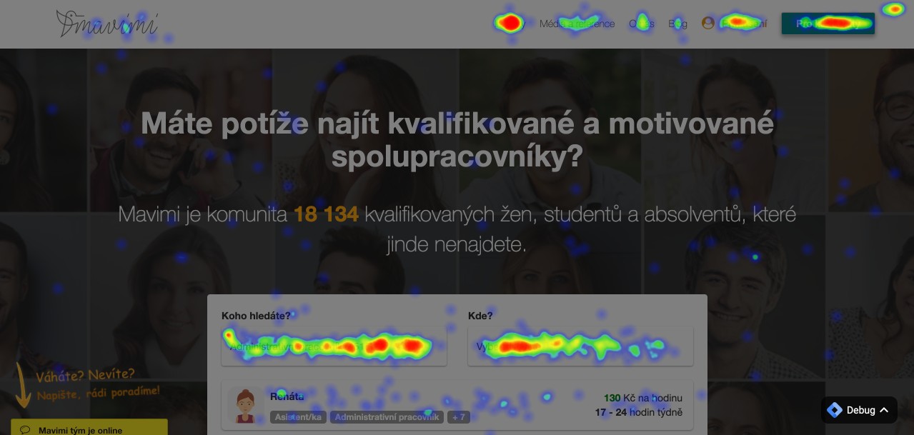
A heatmap is a tool that depicts places and points users tend to focus on, click the most, or read.
In the picture above, you can see areas highlighted with red, green or blue. How to understand these colors?

- Red indicates the highest concentration
- Yellow means higher interest
- Green highlights places with medium interest
- Blue shows the minimal interest of users
- In other parts where there are no colors, visitors don’t click at all
In this case, the concentration of interest means how often users click on a specific area on your site.
Benefits of Tracking Visitors’ Behavior?
The goal of using heat maps is to determine which parts of a website visitors are most interested in. With this analysis, you can understand and customize your web. Once you find reasons for low conversion rates or a high bounce rate, you can offer your products and services more efficiently.
Again, all of this leads to more sales and higher profits.
For instance, you find out that users don’t click on important call-to-action buttons. This means you should:
- Remove all distracting elements on the page
- Highlight the CTA button
- Change the order of content on your page
And test.
Did the behavior of your visitors change? If so, you are on the right way to get the maximum from your website.
How to design effective call-to-action buttons? Read Call to Action Buttons - 5 Most Important Tips to Get More Clicks.
3 Types of Heatmaps You Must Know
Depending on the type of data that a heat map displays, we can divide them into 3 categories:
- Link maps
- Click maps
- Scroll maps
In fact, there are dozens of different kinds of heatmaps that analyze mouse movement on a web, track eyes and how users scan your content or even report the intensity of visitors at geographical points.
Knowing the differences is handy, so I will guide you through these 3 basic types.
Link Maps
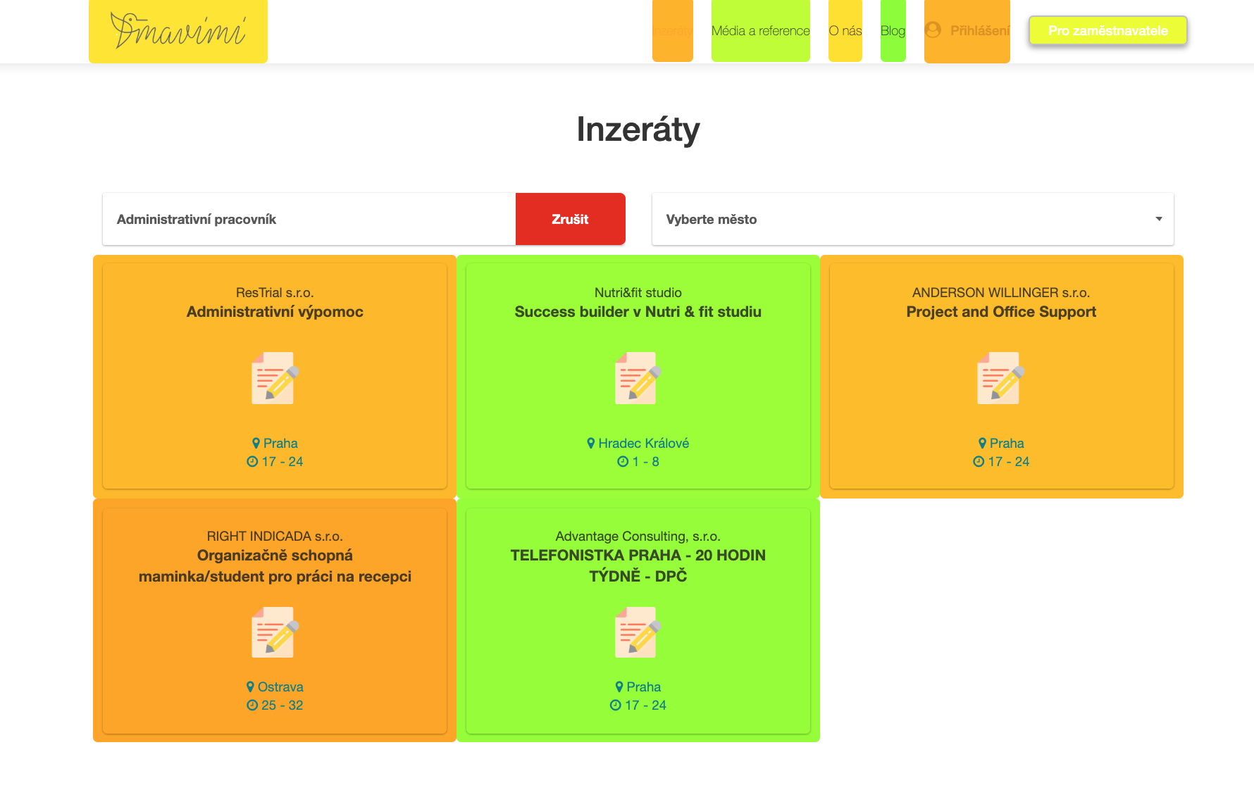
Hyperlinks (or URL links) are the main tracking pattern of link maps. A link map depicts elements with hyperlinks that people click the most and get to other pages on your website.
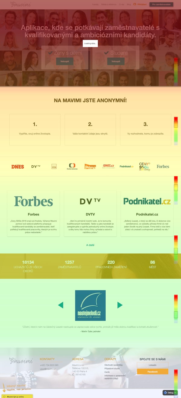
The following heatmapping comes from our partner’s app called Mavimi and shows which job adverts are more popular than others. Again, the colorful scale ranges from red to blue color.

Click Maps
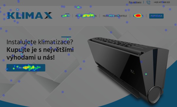
Similarly to link maps, click maps show where visitors click or try to click. It’s a great tool for detecting all unnecessary clicks on your website.
Do they click where you want to, or they overlook something important? Or even more importantly. Do users tend to click on elements that aren’t clickable?
Here is an example of click tracking from Klimax air conditioner website:
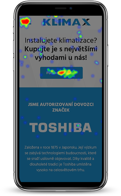
It’s also possible to check taps on mobile devices. In this case, you want to look for touch heatmaps.
Scroll Maps
While scroll maps don’t show detailed analysis, they indicate how deep your visitors scroll down the page. It’s a great tool when deciding where to place certain information on your website.
As a rule of thumb, the more important content it is, the more at the top it should be displayed.
The scale of scroll maps is vertical.
It also marks the fold visitors see without scrolling down the page.
Screen Recordings
Last but not least, another type of data visualization is user recording. Screen or session recordings provide information about how exactly users navigate on your site, what they do, and how fast they progress.
With some tools, you are able to record up to thousands of recordings. So, the only limitation is the time of you or people who would need to analyze each input.
Session replays are another way to review the complete visit of your users. You can find an example in this video from 5:15.
Recordings are particularly useful if you want to analyze a change in visitors’ behavior (e.g., visitors start to bounce more frequently than before) or in case that you need to understand the user's behavior on the website.
Website Heatmap Tools You Shouldn’t Miss
Smartlook and Smartsupp
Products created by a Czech company that grew beyond the borders of the Czech Republic and even Europe years ago. Both of their tools are used by hundreds of thousands of website owners around the world, and I fell in love with their user-friendly navigation and clear statistics.
➜ https://www.smartlook.com - Qualitative analytics for websites and mobile apps.
Includes:
- Session recordings
- Heatmaps
- Events
- Funnels
➜ https://www.smartsupp.com - Smart live chat for web or eshop.
Includes:
- Chat
- Session recordings
Hotjar
https://www.hotjar.com/ - The fast & visual way to understand your users.
Yandex
https://metrica.yandex.com/ - All-Round Web Analytics
Next Steps - How to Create a HeatMap
- Register to the tool of your choice (e.g., https://www.smartlook.cz).
- Send the code to your programmers to deploy it on your website.
- After a few days, log into the analytics tool to discover the beauty and power of heatmaps, session recordings and visual analytics of user behavior on your site
- Customize your site to help users navigate and make more orders.
Based on the heat map report, changes on the webpage will be relevant and directly lead to a growing number of orders, inquiries, or sales.
Don't forget. The goal is not just to look at the maps! The goal is to have better business results. :-)
Want to help visualize your website traffic and set up heat maps? Email me at kristyna@creativehandles.com or fill in this form and get a free 30-minute consultation. Don’t wait anymore and see how we can increase your revenue.

