Why and How to Design Dark Mode for Your App
5 mins read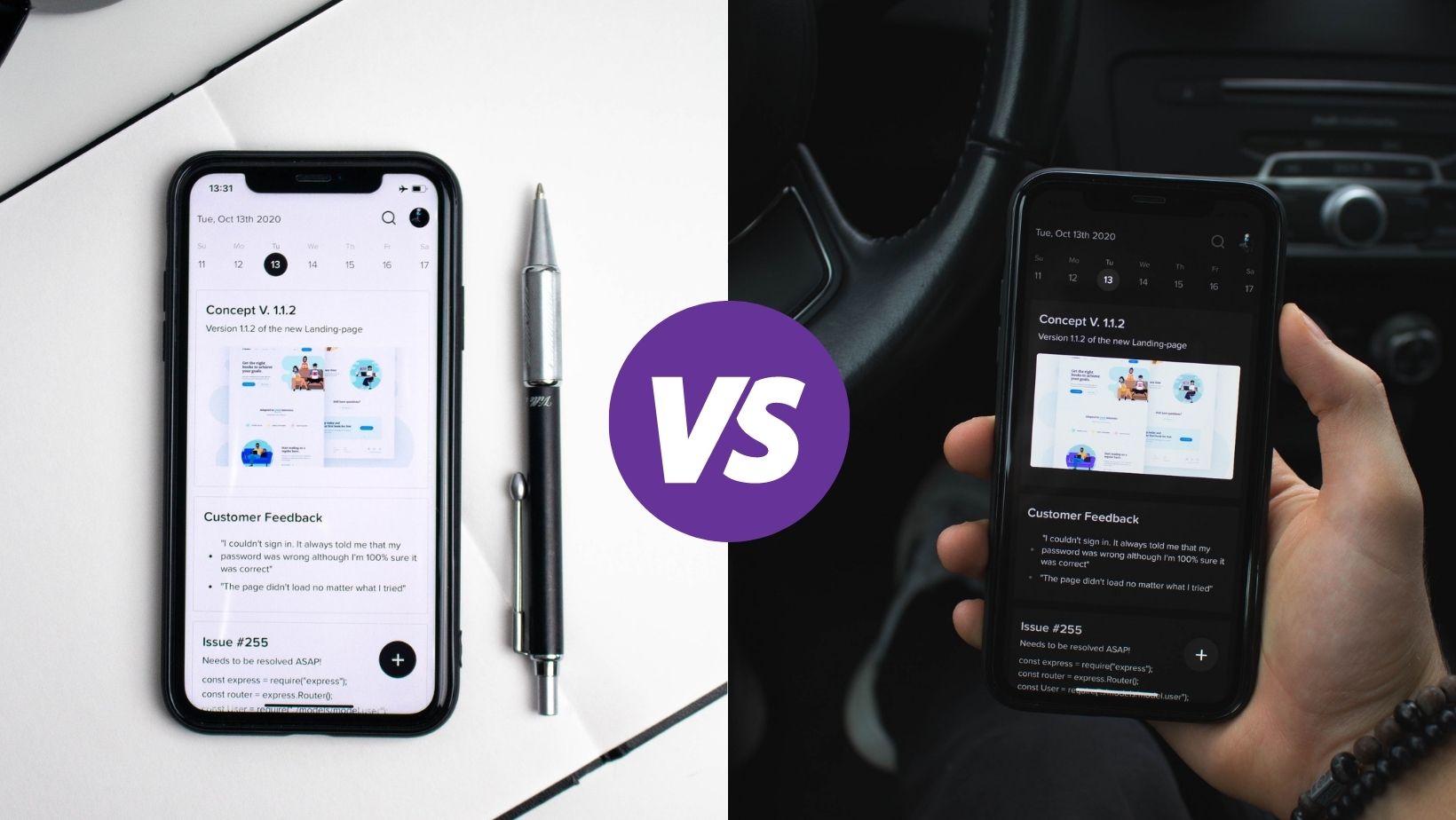
Did you know that dark mode is nothing new? First computers weren't optimized to displayed colors, and a black interface was standard back then. However, with the development of colors, the dark mode was taken over by a light mode that looked more like its real-life counterpart — dark text on white papers.
Nowadays, night mode is one of the most popular features on mobile phones. Its popularity has been growing as well as the number of mobile applications that support the dark scheme.
What are the reasons for its comeback and why you shouldn't want to miss this trend? Continue reading and learn how to design and create your mobile application in dark mode correctly.
What Is Dark Mode?
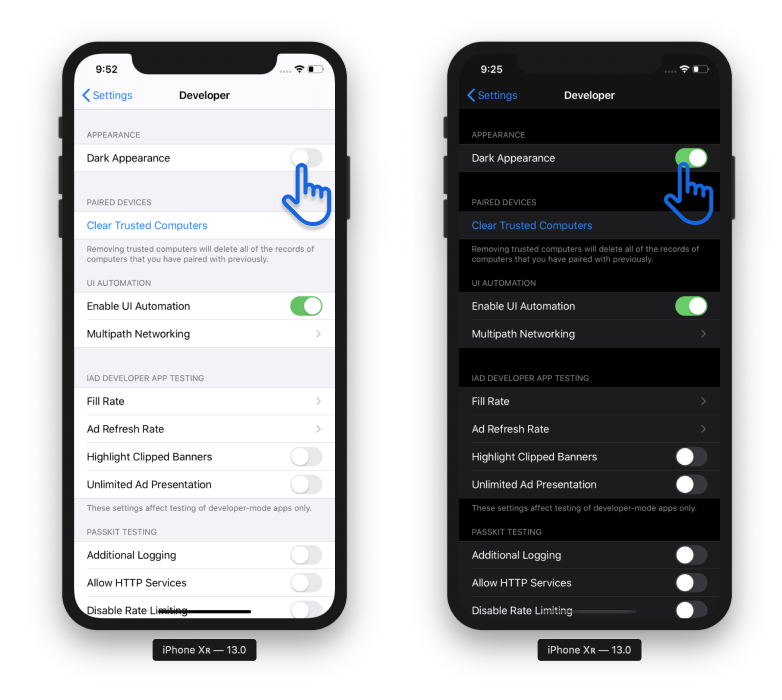
In a nutshell, dark mode changes the color scheme of your phone or application. When turned on, the light background becomes dark, and dark text changes to light colors. It's usually designed as a supplement mode to a default (light) mode.
Source: Microsoft
Does It Save Battery?
A dark theme can save your battery, but only if you have an OLED or AMOLED display. Unlike LCDs, these screens enable the deactivation of black pixels and conserving the phone's energy.
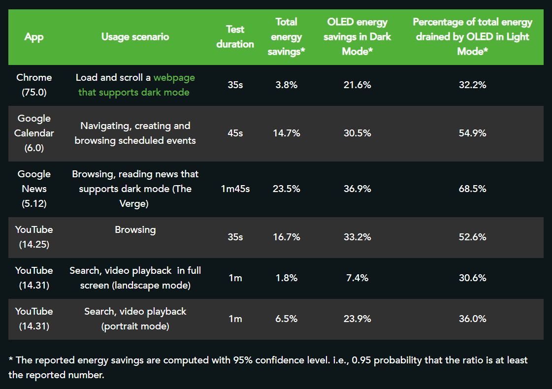
Mobile Enerlytics has researched how much energy the dark mode can save. On average, a mobile phone's battery endurance using the light mode was 30% lower compared to the dark scheme. However, the battery saving is highly dependent on the currently operating application.
Source: Mobile Enerlytics
Is It Better for Eyes?
The night mode is neither bad nor good for our eyes. It always depends on the circumstances. For example, a light mode is more natural and a recommended scheme if we want to use our digital devices for a long period of time especially when reading or writing. Pupils get narrow, which allows us to see sharper and help us to be more productive. Our eyes by approximately 26% worse at reading when using dark mode.
Even though watching the screen in the evening without the ambient light around is never suitable for our eyes, dark shades are more gentle than bright light colors. Just see for yourself how pleasant would this dose of light be in the evening.
Source: uxdesign.cc
It wouldn't be much pleasant experience, would it be? Now, when you understand the reasons for dark mode popularity, let's look closer at developing such an app.
How to Design an App in Dark Mode Correctly?
Although developing an application in dark mode may seem simple (just switching light colors to dark ones and vice versa), there is much more to focus on. Now, it doesn't matter whether you program an app for android or iOS because, in either case, a wrongly designed dark mode can easily worsen the UX of the whole project. So what are the rules to follow to create an application in dark mode correctly?
Building an app from scratch? Read How to Make an App - 5 Fundamental Steps
1. No Universal Black
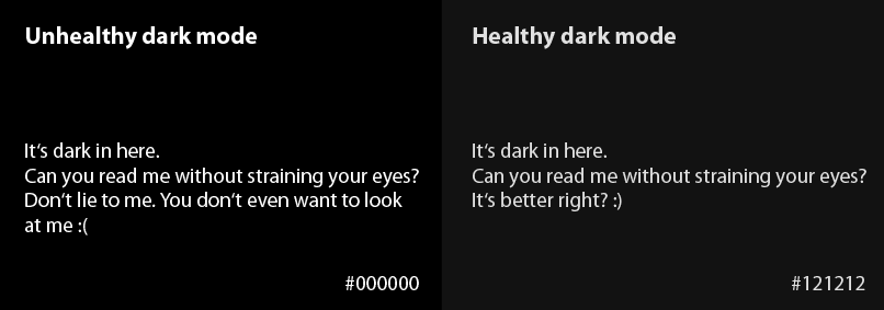
100% contrast can cause eye pain and makes the text more difficult to read. Therefore, use dark gray, most often #121212 instead of black (#000000). It not only reduces the contrast and the associated eye strain but also helps to express a wider range of colors, heights, and depths. Shadows help to express elevation levels and distinguish them from one another.
Source: mindinventory.com
2. No Pure White
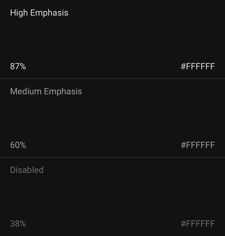
Similar to a dark background, the light text isn't pure white. A bright color causes trouble when reading, and therefore opacity plays a crucial role when designing an app in a dark scheme. In general, the opacity should be reduced, reaching its maximum of around 87%.
Source: material.io
3. Color Inversion
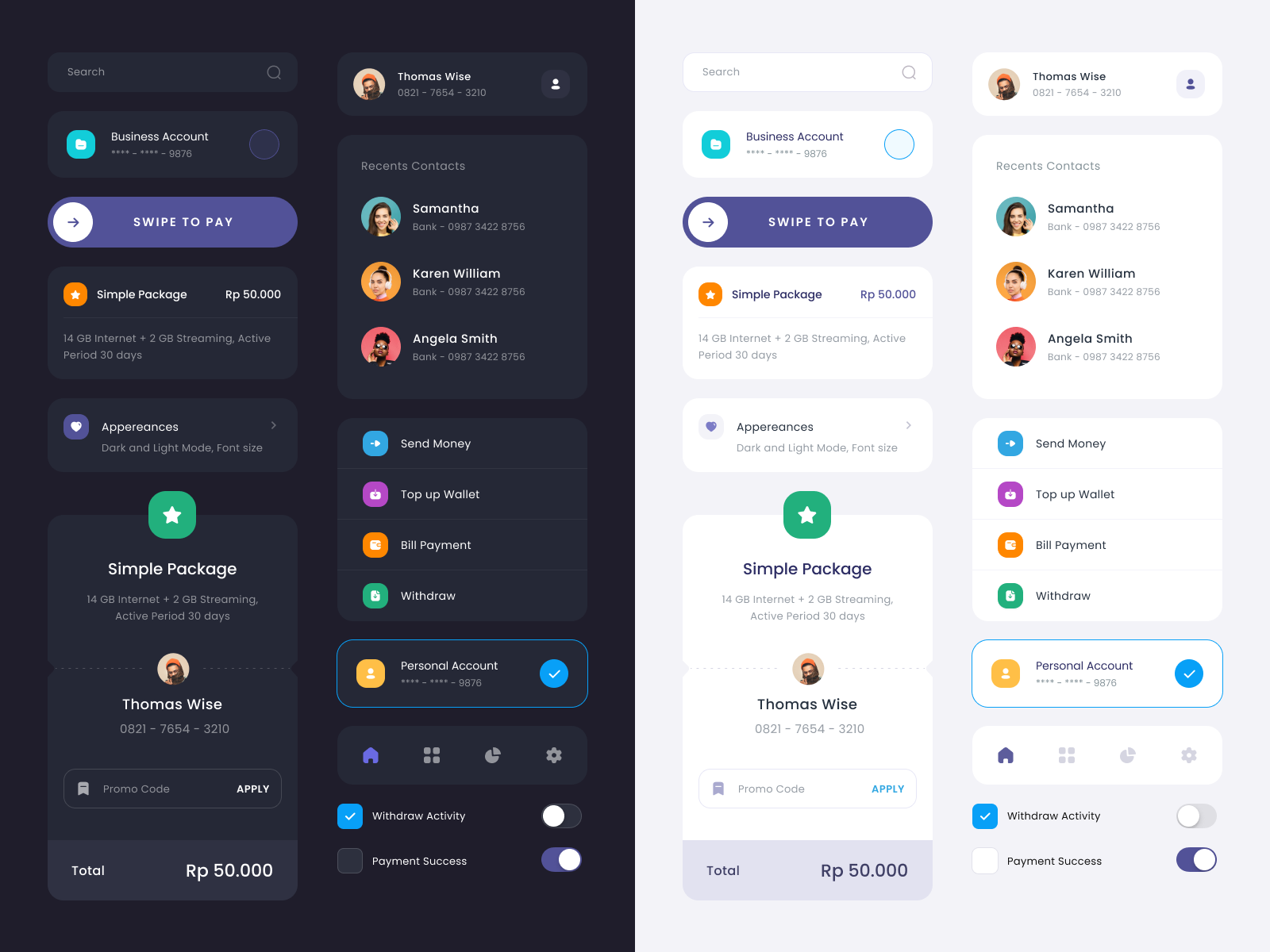
Dark mode doesn't and can't be developed exactly according to the corresponding light mode. The human brain perceives colors differently on diverse backgrounds, so it's impossible to communicate the same emotions through the same color. Instead, try to find a color alternative and take advantage of the fact that colors on a dark background look more vivid.
Source: dribbble.com
4. Avoid Saturated Colors
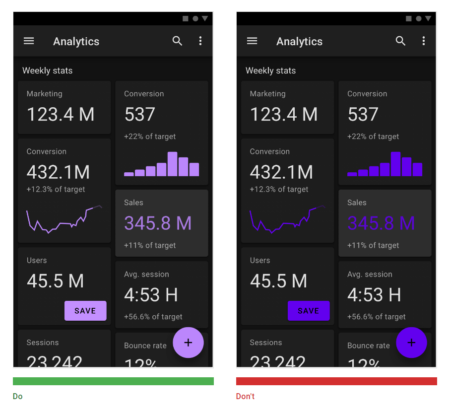
Saturated colors may look great on a light background, but they make legibility and overall impression worse on a dark one. It is recommended to select lighter tones in the range of 200-50.
5. Illustrations and animations
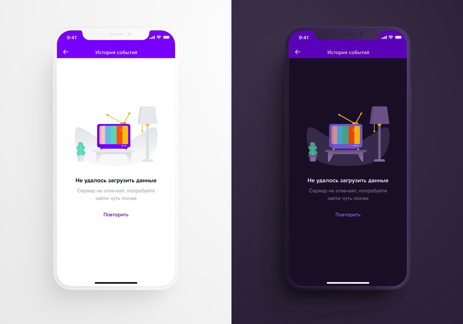
Similar to color modifications, you can't avoid design adjustments of illustrations and animations when creating an application in dark mode. Each element of your application must not only correspond to the new color palette but also be legible/visible.
Source: uxdesign.cc
6. Right to Choose
As you probably already know, dark mode isn't the ultimate solution for every mobile app or every situation. So why not give the freedom to decide to your users. The easiest way is to implement a switch that enables them to change from light to dark mode anytime.
With dark-only applications, you could lose your loyal customers because they would be denied the opportunity to influence their own user experience.
7. Testing
When developing an app, it needs to be properly tested. Always. Now, in addition to testing the responsive interface and functionality, you should also focus on testing both modes. Don't forget to check their appearance even in "extreme conditions" such as the low/high level of brightness or direct sunlight.
Should You Develop App in Dark Mode?
Without any doubt, a dark scheme has its charisma and evokes particular emotions in your customers, such as courage, strength, and luxury. While most users enjoy the possibility of their own adjustments of apps, dark mode became a stylish solution that you don't want to miss out on.
Correctly designed mobile application in dark mode will increase the overall user-friendliness of your app, popularity among customers and therefore move your business to another level.
Get Ready for It
Don't underestimate the preparation. If you want to create an application in dark mode, focus on it from the very beginning of development. Assign the designer to prepare a color palette for both modes, go through the wireframes in the dark scheme, and make sure that both UX and UI of the application have not deteriorated in any way. And above all, consult this step with experts. There is nothing worse than finding out that you have forgotten a step and the application doesn't work as it should.
Are you developing the application in dark or light mode? Let me know, and I will be happy to advise you and guide you through the whole process step by step. Or fill out this form and get a free 30-minute consultation on your project.
Schedule a free consultation
Ondrej Lang
Managing Partner & Growth Hacker
Finalist of the Startupper of the Year 2019 in the Czech Republic. SDGs Czech 2019 winner with Mavimi. Winner of Masters Gate CZE 2017 in the category of small and medium e-shops with Raj kovani. Ondrej helps companies grow faster, thanks to hacks and digital opportunities. Do you want to grow faster? Write to ondrej@creativehandles.com.

